
Project

PlaceCrafter: curating urban functional regions from OpenStreetMap points of interest

A browser-based platial analysis tool that finds the functional regions a city actually uses, rather than the ones it is administratively divided into. Three clustering algorithms over live Overpass data, every region scored against nearest neighbour index, silhouette and Moran's I before it is believed.

Period

2025

Status

Complete

Role

Author and lead developer

Areas

TypeScript · React · Leaflet · Turf.js · D3.js · OpenStreetMap · Overpass · Clustering

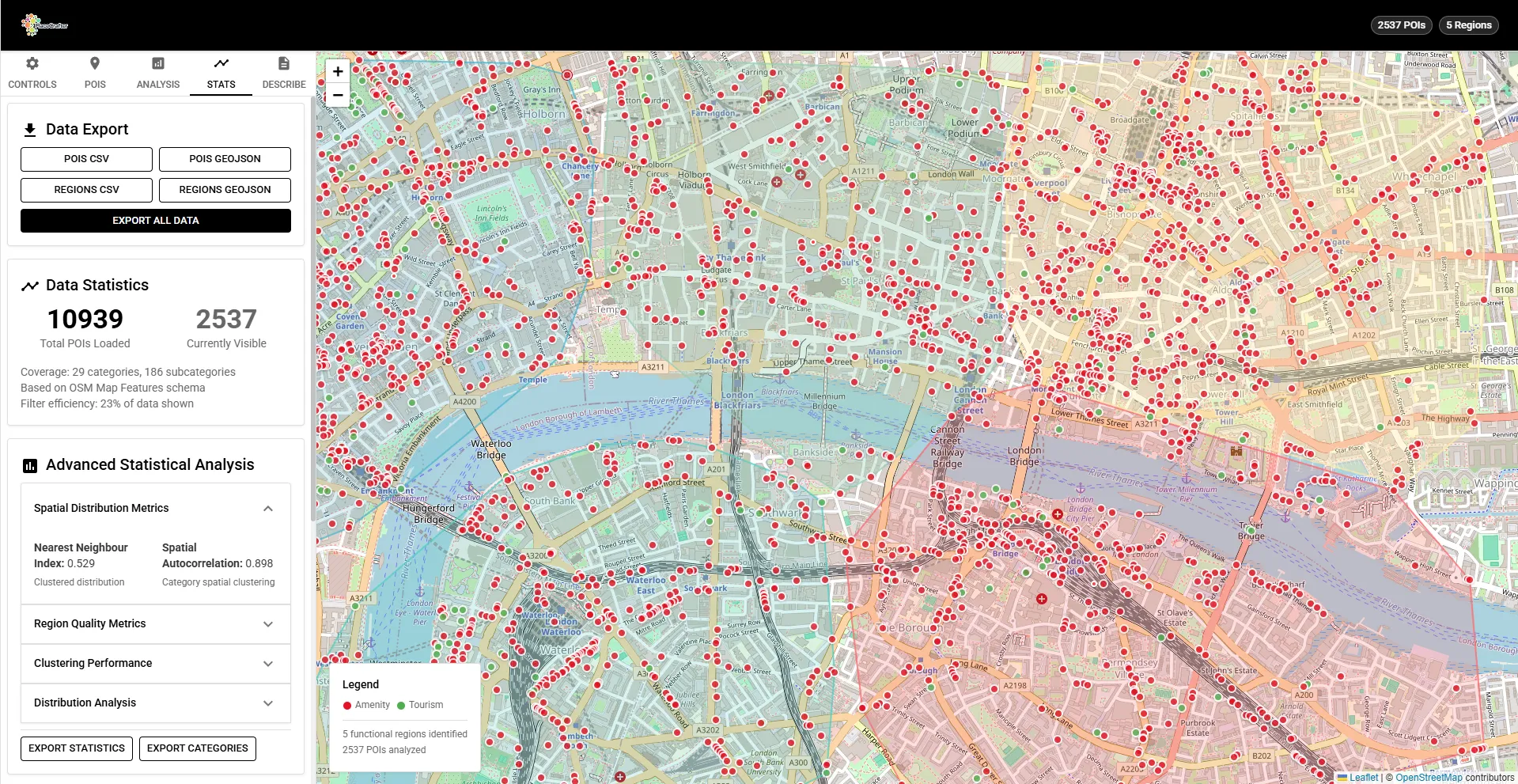
The PlaceCrafter interface over central London, showing 2,537 visible points of interest as coloured dots across five shaded functional regions, with a statistics panel reporting a nearest neighbour index of 0.529 and spatial autocorrelation of 0.898.
Figure

Central London, five functional regions from 2,537 visible POIs out of 10,939 loaded. The panel on the left is the part that matters: every region arrives with its own statistics, so a cluster can be rejected rather than admired.

  • 18Functional regionsFound in the Nottingham case study from 534 filtered POIs across tourism, historical, leisure and natural categories.
  • 0.83Silhouette scoreInternal cohesion of those regions. Moran's I of 0.68 on the same run confirms the clustering is spatial structure, not an artefact of the algorithm.
  • 186OSM subcategoriesAcross 29 categories, read from the OSM Map Features schema, so the filter vocabulary is the one mappers already use.
  • 3Clustering algorithmsK-Means for compact formations, DBSCAN for irregular spatial structures, hierarchical for multi-level nesting. The analyst picks, the tool does not decide.

The brief

A city is not the regions its administrators drew. It is the regions people use, and those cross every boundary on the official map. Formal GIS handles space well and place badly: it can tell you which ward a cafe sits in, and nothing about the quarter the cafe belongs to.

PlaceCrafter identifies platial regions, functionally coherent areas that emerge from dense concentrations of particular points of interest, using data OpenStreetMap already holds. The question it answers is how space is used rather than how it was divided.

The insight

The useful decision was to make statistical validation part of the interface rather than a separate step someone might skip.

Clustering POIs and drawing hulls around the result is easy, and it produces convincing pictures whether or not the clusters mean anything. Every region here carries a nearest neighbour index, a silhouette score and a Moran’s I, so the analyst can see the difference between structure and noise before building an argument on it. In the Nottingham case study those numbers, 0.68 and 0.83, are what allow the 18 regions to be reported as findings rather than as suggestions.

The second decision was to leave the algorithm choice with the analyst. Compact formations, density-led shapes and nested hierarchies are genuinely different urban patterns, and a tool that silently picks K-Means for all of them is making a claim about the city on the user’s behalf.

What it does not do

It captures place through the functional coherence of POIs, which is one dimension of a much larger thing. Temporal change and subjective meaning are both absent: this shows where the museums cluster, not what the quarter feels like at 11pm.

The output inherits OSM’s biases. Commercial and tourist features are mapped far more completely than informal or everyday ones, so the regions skew toward what is visible to mappers. Clustering responds to spatial density and tag semantics, neither of which is how a resident draws a boundary.

Planned work runs in the obvious directions: historical analysis to track how platial regions change, multi-comparative views across cities and timeframes, and a qualitative study of how analysts actually read the output.

How it works

4 stages
  1. 01

    Filter with the vocabulary OSM already has

    Phase one is category selection. POIs are grouped using the OSM Map Features schema rather than a bespoke taxonomy, 29 categories over 186 subcategories, and the grouping is editable per analytical task. Data is pulled live from the Overpass API, so a study area is defined by panning the map rather than by preparing an extract.

    Filter efficiency is reported alongside the counts. In the London run, 2,537 of 10,939 loaded POIs pass the active filter, which is 23 percent of the data.

  2. 02

    Cluster interactively, with the choice exposed

    Phase two applies clustering to the filtered group. K-Means finds compact formations, DBSCAN finds irregular density-led structures, and hierarchical clustering exposes multi-level nesting. All three are user-selectable with live parameters, because the right algorithm depends on the urban form being examined and pretending otherwise hides the assumption.

    Clustering runs client-side over the loaded POI set, so parameters can be swept and compared without a round trip.

  3. 03

    Make every region prove itself

    Phase three is statistical validation, and it is the reason the tool is more than a hotspot renderer. Each region is scored with the nearest neighbour index for clustering intensity, silhouette scores for internal coherence, and a simplified Moran's I for category-based spatial dependency. A cluster that looks convincing and scores badly is visible as such.

    Nottingham: Moran's I 0.68, silhouette 0.83. London: nearest neighbour index 0.529, spatial autocorrelation 0.898.

  4. 04

    Render ambiguity rather than hiding it

    Phase four is platial readability. Regions carry POI type, diversity score and density, and the visualisation layer is modular: fuzzy spray-can rendering, region influence grids, convex hulls, kernel density heatmaps and per-region quality indicators. Functional regions have soft edges, and a hard boundary would be a claim the data does not support.

    POIs and regions both export as CSV or GeoJSON, so a session ends in something another tool can read.

Outcomes

  • Peer-reviewed and citable

    Published at OSMScience 2025 in Manila, with Gary Priestnall, University of Nottingham. The Nottingham case study is reproducible from the paper: 534 POIs, 18 regions, 344 historical and 111 leisure POIs as the dominant categories.

  • Validation as a first-class feature

    Most clustering interfaces stop at the visualisation. Reporting nearest neighbour index, silhouette and Moran's I next to every region turns an exploratory picture into a claim that can be checked, which is what makes the output usable in research.

  • Platial analysis without a GIS install

    The whole pipeline, from Overpass query to validated regions to export, runs in a browser tab. That removes the setup cost that keeps this kind of analysis inside GIS departments.

Stack

Application
TypeScript, React, Vite
Mapping
Leaflet, Turf.js, D3.js
Data
Overpass API, OpenStreetMap Map Features schema
Analysis
K-Means, DBSCAN, Hierarchical clustering, Moran's I, Silhouette score, Nearest neighbour index

Project team

  • James WilliamsBirmingham Newman University
  • Gary PriestnallUniversity of Nottingham

Work like this

Start a
conversation →

Available for consulting engagements and research collaborations at this scale. Email james@jameswil.com.